Power BI Data Quality Dashboard Examples
Data quality is a problem for every company. Legacy systems, new systems, and data acquired from mergers or acquisitions have one common theme. Insufficient data and poor data quality are everywhere. Leverage options in Power BI to create Power BI data quality dashboard examples to start your journey to better data without investing in another software platform.
Your First Power BI Data Quality Project
Getting started with a data quality project is often where I see companies get stuck. They are unsure how to start or which systems to start with. With data quality projects, don’t let great be the enemy of good. Start small, pick some critical data that you know has data quality issues and start there.
- Select the data to profile, start small 2o columns or less
- Assign the data owner
- Assign the data steward
- Profile the data with Power BI
- Review outputs with Data stewards and data owner
- Create processes to clean up source system inputs
PowerSchool Power BI Data Quality Examples
To show how Power BI can be used to build a Power BI data quality dashboard. I will use some columns from the student table in PowerSchool. Having accurate data about students is critical for various aspects of administration and even funding.
The data quality and profiling options are built into the Power Query Editor on the View tab as shown below.
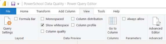
To see how each option works, turn them on one by one and review the output. To see column quality select the checkbox and Power BI will add a window above your columns with additional data.
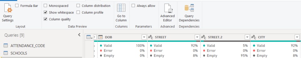
After enabling “Column Quality” you can see the percentage of records that are valid, empty or have errors when imported into Power BI. This is a great quick way to get a sense of what is in your data. For instance, the DOB field shows 100% valid. This means that all rows have data that matches the data type. It does not mean that all dates of birth are accurate or in a certain format. The column “Street” shows 92% valid and 8% empty. This lets you see how populated your data is in a few simple clicks in Power Query.
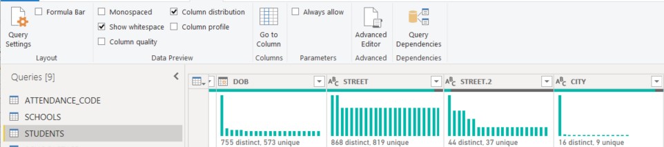
The next option is Column Distribution in Power Query. Uncheck Column Quality and select Column Distribution. You will now see bar charts and data summaries that show you what is in the data.
As you can see from these examples, you can quickly get insights from your data. Start you data quality journey with Power BI data quality dashboard examples to show your users the impact of bad data on decisions they are making.
Contact me with questions.
CDO Advisors Microsoft Power BI Solutions:
Get Power BI Consulting – CDO Advisors Increase Power BI Adoption
Increase Power BI Adoption – See how we help you get more from your investment
Power BI Consulting as a Service – Low Monthly Fees, Pay Per Month Per User
Microsoft Power BI Demo – Compare your current reporting to Power BI
Power BI Quick Start Solutions – Ready to start or enhance your Power BI?
Microsoft Power BI Consulting – Learn more about our Consultants
Use Power BI to Transform Your Data – Transform your business with Data