What is Power BI Key Influencers Visualization?
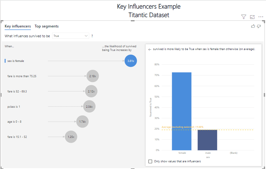
The Power BI Key Influencers visualization is designed to help you understand what data impacts the metric you are interested in. For example, I used the Titanic dataset to see what data was influencing the survival of a passenger. In this example, I want to see what factors about the passengers were critical to their survival. We all have heard women and children first. Now let us see what the data shows and how to get that information from the Key Influencers visualization.
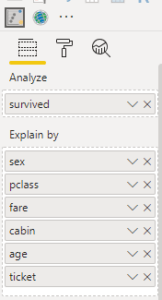
These are the columns I used to derive my results within Power BI Key Influencers.
- survived – What we want to see the influence on
- Sex
- pclass (Passenger Class)
- fare
- cabin
- age
- ticket
Once these values are setup in the options for the Key Influencers it quickly produced the following result. As you can see the likelihood of surviving was 3.81x higher if you were female. Next on the list was the fare value. Passengers whose tickets that cost more than 75.25 where 2.18x more likely to survive. By simply adding or removing different data elements the Explain by in the visualization updates to help you understand how each data point influences the likelihood of survival.
How to use Power BI Key Influencers for Business
You can leverage this visualization to get insights on what is happening in your business. Possible use cases are looking at customer churn, employee churn, product mix. Try it out and see how the data responds. Start with the data point you want to learn more about. Then one by one add new data elements to understand how the combination of factors influence your business.
Watch my YouTube Video and see this example in action – Power BI Key Influencers Example Video
Learn more about machine learning
You can find the Titanic dataset here
For complete documentation see – Key Influencers Power BI
Visualization Types in Power BI – Visualization types in Power BI