Get Employees Using Your Dashboards
I frequently work with companies that have existing reports and dashboards in place from legacy platforms. Often I hear that they invested in the product and built a solution and then were unhappy with the adoption by their employees. This is more common than it should be and has left a bad perception of data reporting platforms in the minds of many executives. Working with a variety of companies has allowed me to see what does work to increase user adoption and increase the usage of an modern enterprise data and reporting platform. There are five keys to a new reporting platform initiative that has lead to successful solutions.
Management Use of the Dashboards
The highest levels of management and the business sponsor must use the solution. They need to use it as much as possible and let others see them using it. This could be during meetings, sending screenshots with questions or only having metrics presented from the implemented dashboards. Once direct reports see that their managers are using the dashboards. They will be sure to start using them too. Having questions generated from the dashboards and sent to direct reports generates a powerful message that the investment will be used.
Accurate Data
When starting a new dashboard initiative it is critical that the data is accurate. Do not include metrics or KPIs that have data quality issues. You need your users to trust the data in order to increase adoption. It is better to have 5 accurate metrics that are being automatically updated with high data accuracy. Than to have 10 with some that users may not trust. In addition, only roll out new metrics once you can trust the data processing to ensure the metrics will be accurate. Once your users lose faith in the data, it takes a very long time to get them to trust it.
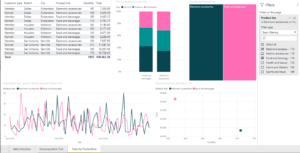
Visualizations Employees Understand
There are many schools of thought on data visualization best practices. In my experience, it is better to start with visualization that the users understand than doing what may a design best practice. Keep the visuals simple and to the minimum number required on the dashboard to enable effective decisions. I frequently am asked by employees how to interpret the graph, can I break this dashboard, or how do get this graph to a data grid. Remember who you are designing the dashboards for and focus on what they need to do their job effectively. Over time, I have been able to get users more comfortable with the solution and introduce more advanced visualizations.
Alerting
Users need to know what data to focus on. Alerting allows users to set notifications on metrics when they hit a certain value. For instance, if you are running a call center you may want an alert that tells you when you Number of Callers on Hold reaches a certain limit. A alert will be sent to your desktop, tablet or phone notifying you of the issue. Alerting is critical to employees leveraging the solution. When an alert has gone off the users can engage on the platform to see what else could be causing the issue. Further driving adoption of the platform.
Subscriptions
Have the dashboard information emailed to you or your team on a regular basis. You could get the report emailed hourly, daily, weekly, etc. Depending upon what your business needs are you can ensure your employees are seeing the dashboards when you want them to. They can then open the email and link back to the dashboard to get full interactivity and self-service BI. With subscriptions, there is no excuse for not seeing the data you have invested in curating and presenting and get your employees using your dashboards.
See examples of our Power BI Dashboards
Improve Your Business with Dashboards in Power BI
Executive Dashboards with Power BI
Get a Dashboard in 10 Days Quick Start
Learn about Microsoft Power BI
CDO Advisors Microsoft Power BI Solutions:
BI as a Service – Low Monthly Fees, Pay Per Month Per User
Executive Dashboards – Get Dashboards in 4 Weeks
Healthcare Dashboard Proof of Concept – SEE your data visualized
Microsoft Power BI Demo – Compare your current reporting to Power BI
Power BI Quick Start Solutions – Ready to start or enhance your Power BI?
Train Your Team – Remote Power BI Developer and End User Training
Use Power BI for Finance Teams – Learn how Power BI can improve operations
Virtual Chief Data Officer – Confused by all your data? We can help