Credit Union Membership Map in Power BI
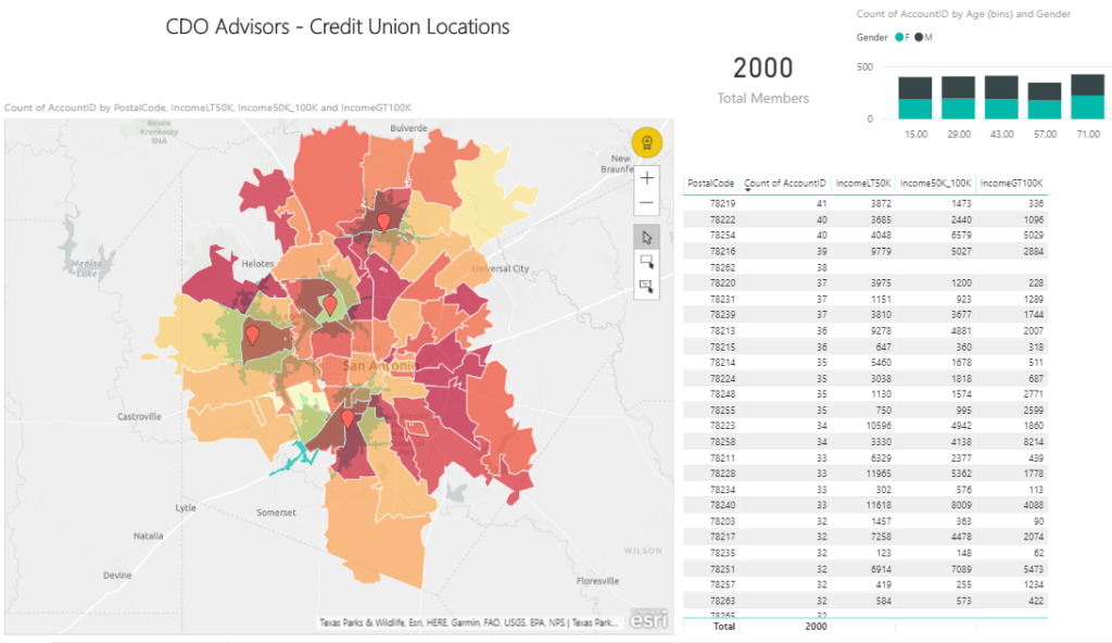
This example uses membership data for a fictional credit union to map the members by zipcode. A heatmap is then created to show which zip codes have the most members. The darker the color the more members are in that zip code. In addition, the 4 branch locations are added as red pins with a 10 minute drive time. The map is interactive and clicking on a zip code or push pin will highlight the appropriate data. This information was also combined with US Census data to show the number of households by income bands to help you determine where to build new locations or target your marketing efforts.
Click here for the full interactive report – Credit Union
CDO Advisors Microsoft Power BI Solutions:
BI as a Service – Low Monthly Fees, Pay Per Month Per User
Executive Dashboards – Get Dashboards in 4 Weeks
Healthcare Dashboard Proof of Concept – SEE your data visualized
Microsoft Power BI Demo – Compare your current reporting to Power BI
Power BI Quick Start Solutions – Ready to start or enhance your Power BI?
Train Your Team – Remote Power BI Developer and End User Training
Use Power BI for Finance Teams – Learn how Power BI can improve operations
Virtual Chief Data Officer – Confused by all your data? We can help